
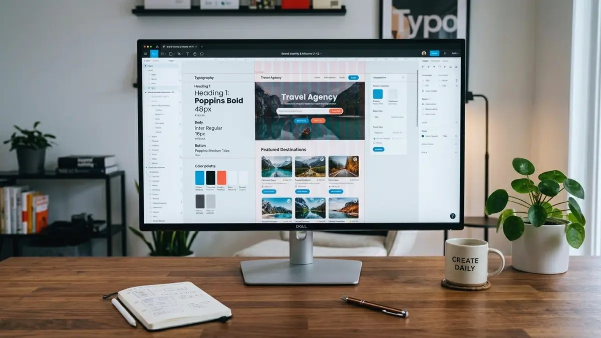
What Are the 10 Graphic Design Best Practices to Follow in 2026?
I’ve been working with designers and marketers across SaaS, local businesses, and e‑commerce at BrainGig for years, and one pattern shows up in almost every project: the visuals decide whether people stay or bounce.
In usability studies, people form a first impression of a page in as little as 50 milliseconds, which means your layout, colors, and typography start “talking” long before your copy does. On top of that, visual content gets around 94% more views than text‑only content, and people can recall images at around 65% after a few days compared to about 10% for text alone, thanks to what psychologists call the picture superiority effect.
So when we talk about graphic design best practices, we’re not talking about making things “pretty.” We’re talking about clarity, trust, and results. The right design principles help users understand your message faster, remember it longer, and actually take action.
Below, I’ll walk you through 10 design principles I rely on in real projects, explain why they work, and show you at least one simple graphic designing example for each so you can apply them to your own brand.

If you just want the essentials, here are the 10 graphic design best practices to focus on this year:
- Start with one clear message and goal, not “nice visuals”: Every strong layout begins with a single primary action or idea; design principles like hierarchy only work if you know what should stand out first.
- Use visual hierarchy so people can scan in seconds: Users decide whether to stay or leave within 50 ms, so size, weight, and placement must guide their eye from headline to CTA without friction.
- Keep layouts simple and use white space generously: Designs that respect negative space are easier to understand and remember, and “less is more” is a core principle across modern design guidelines.
- Align and group elements to create order: Alignment, proximity, and balance reduce visual noise and help users instantly see what belongs together.
- Choose typography for readability first, personality second: Clear, consistent type hierarchies make text easier to scan and are central to good visual hierarchy and usability.
- Use color intentionally for emotion and accessibility: Color influences trust and emotion; strong contrast and a limited palette help both readability and brand recognition.
- Create contrast to draw attention to what matters most: Contrast in size, weight, and color is one of the fastest ways to create emphasis and guide attention.
- Repeat styles to build a simple design system: Repetition and unity make your graphics feel like one coherent brand, which is why design systems have become standard practice.
- Design for real devices, channels, and contexts: With over half of traffic coming from mobile, graphics must work on small screens, in feeds, and inside different content formats.
- Test, measure, and refine instead of relying on “looks good”: Visuals can boost views by 94% and engagement by 150%, but only if you iterate based on performance data, not just intuition.
Ready to implement these best practices? Check out BrainGig’s professional design services including graphic design, web design, landing page design, and branding solutions to elevate your visual content and drive better results for your business.
Quick snapshot: 10 best practices and how to apply them
| Best practice | What it looks like in real life | Simple way to apply it |
|---|---|---|
| Clear goal first | Pretty banners with no obvious CTA | Write 1‑sentence goal before opening your design tool |
| Strong hierarchy | All text same size and color | Make headline 2–3× larger and bolder than body text |
| Embrace white space | Crowded layouts, edge‑to‑edge content | Add margins, increase line spacing, remove 20–30% of elements |
| Alignment & proximity | Randomly placed text and icons | Snap elements to a grid, group related items closer together |
| Readable typography | Fancy scripts for long paragraphs | Use 1–2 clean fonts with clear size ladder (H1, H2, body) |
| Intentional color | Rainbow palette on every asset | Pick 3–5 brand colors and define how each is used |
| Effective contrast | Pale text on pale background | Check contrast ratios and use dark‑on‑light or light‑on‑dark |
| Consistent repetition | Every graphic looks unrelated | Reuse the same colors, buttons, and illustration style |
| Context‑aware design | Desktop‑only mockups | Preview designs on mobile frames and social feed mockups |
| Test and refine | “Looks good” is the only test | Track clicks, scroll depth, or A/B test key visuals |
Practice 1: Start with one clear message and goal
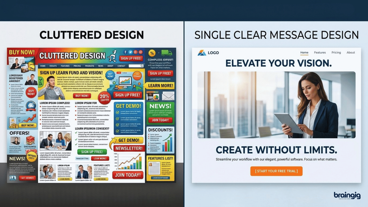
When I review underperforming creatives, the core problem is usually not “bad design skills.” It’s that the designer tried to communicate five things at once which are features, discounts, brand story, social proof and the layout has no clear priority.
Most design principles assume you’ve already decided what matters most: emphasis, hierarchy, and unity only work when there is a primary message to emphasize.
How to put this into practice
- Before you touch any tool, write one sentence: “This graphic should get people to…..”
- Turn that into your main headline or most prominent visual element.
- Ask yourself if someone sees this graphic for 2 seconds in a feed, what should they remember or do?
A quick graphic designing example: You’re creating a social post for a webinar. Instead of cramming date, time, topic, host bio, and three benefits in equal size, you treat “Free webinar: 5 UX Design Principles That Boost Conversions” as the hero message, with the time and date secondary and everything else minimal.
Practice 2: Use visual hierarchy so people can scan in seconds
Visual hierarchy is the way you arrange elements so the eye naturally goes from most important to least important. Research on first impressions shows people form opinions about a website in as little as 50 milliseconds, and often within 17 ms, which means your hierarchy either saves or kills that first impression.
Good hierarchy uses size, weight, color, and position to guide attention: big, bold headlines; medium‑sized subheads; lighter body text; and clear CTAs.
How to put this into practice
- Make your primary headline 2–3 times larger than body text and bolder than anything else.
- Use consistent heading levels (H1, H2, H3) so users can predict what matters visually.
- Place the most important information higher on the page or graphic, above the fold in a web layout.
Graphic designing example: On a hero banner, “Launch Your Brand in 30 Days” sits large and bold, the supporting line is smaller, and the CTA button has a contrasting color, making the hierarchy obvious even when you squint.
Practice 3: Keep layouts simple and respect white space
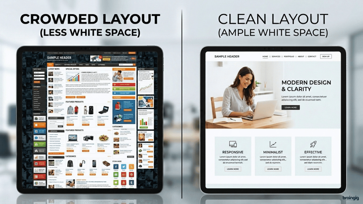
One of the most underrated graphic design best practices is simply leaving things out. Design principles like minimalism, white space, and simplicity all exist to reduce cognitive load so users can understand your message faster.
White space (or negative space) is the area of a design you intentionally leave blank. It separates sections, gives elements room to breathe, and makes content easier to scan and remember.
Studies on the picture superiority effect show that people can recall images at around 65% accuracy after a few days, compared to only about 10% recall for text, especially when imagery and layout are uncluttered.
How to put this into practice
- Increase padding around text blocks, buttons, and images.
- Remove decorative elements that don’t support the message like icons, lines, or shapes that add noise.
- Aim for one main idea per screen or graphic, especially on mobile.
Graphic designing example: You redesign a crowded pricing section into three cards, each with a clear plan name, price, 3–5 key features, and plenty of space between them. Conversion rate improves because users can compare plans in a single glance.
Practice 4: Align and group elements to create order
Alignment, proximity, and balance are classic design principles because our brains like patterns and order. When text boxes, icons, and buttons float in random positions, the design feels “off” even if people can’t explain why.
Proximity means related items are close together and unrelated items are separated, which helps users instantly understand what belongs together.
How to put this into practice
- Use a grid: align text and elements to consistent vertical and horizontal lines.
- Group labels directly with their inputs, captions with their images, and headlines close to their corresponding paragraphs.
- Check for consistent margins on all sides; uneven spacing is one of the fastest ways to break perceived quality.
Graphic designing example: On a service page, you align all section headings to the left, keep equal spacing between sections, and group each icon directly above its label. The page suddenly feels more professional even before any copy changes.
Read our blog on tips to create stunning visual designing and graphics content to learn simple design ideas, practical examples, and easy ways to improve your graphics.
Practice 5: Choose typography for readability first
Typography is more than picking a nice font; it’s about making your content effortless to read. Graphic design resources consistently emphasize hierarchy, readability, and consistency as key to good type.
In practice, that means avoiding long blocks of text in decorative fonts, keeping line lengths manageable, and making sure your font sizes are large enough across devices.
How to put this into practice
- Use no more than two typefaces (e.g., one for headings, one for body text).
- Set a clear scale: for example, 32 px for H1, 24 px for H2, 18 px for H3, and 16 px for body on web.
- Increase line spacing slightly (e.g., 1.4–1.6) to improve readability, especially in longer paragraphs.
Graphic designing example: Your blog feature image originally uses a script font for the main title. You switch to a clean sans‑serif for the title and keep the script only for a small accent word. Click‑through improves because people can actually read it at thumbnail size.
Practice 6: Use color intentionally for emotion and accessibility
Color is one of the strongest levers you have for emotion, brand recognition, and usability. Design guides from Adobe and others highlight color as a core principle for emphasis, hierarchy, and mood.
At the same time, poor color choices like low contrast, too many tones, or inaccessible combinations can make designs hard to read and exclude users with visual impairments.
How to put this into practice
- Define a simple palette: primary, secondary, accent, and neutrals, and document how each is used.
- Ensure sufficient contrast between text and background; tools based on accessibility guidelines can help you check ratios.
- Use color consistently to mean the same things (e.g., one color for primary CTAs, another for alerts).
Graphic designing example: A landing page originally uses light gray text on a pastel background. You adjust it to dark text on a light background and reserve bright brand colors for buttons. Time on page and scroll depth improve because users don’t have to struggle to read.
Practice 7: Create contrast to draw attention to what matters most
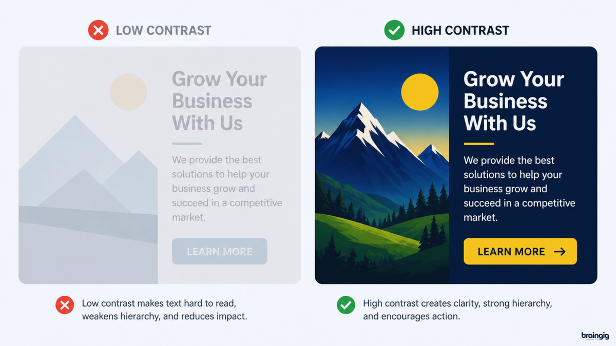
Contrast is differences in color, size, weight, or shape that makes elements stand out. Adobe’s design principles call contrast “critical” for highlighting important content and improving readability.
From a cognitive perspective, contrast helps the brain quickly separate foreground from background and identify the focal point, which is crucial when users skim.
How to put this into practice
- Make your CTA button noticeably different from surrounding elements via color and size.
- Use bold or larger type for key stats or phrases you want users to remember.
- Avoid “low‑contrast everything” where all text appears in similar gray tones and sizes.
Graphic designing example: In a case study graphic, you highlight “+128% conversion rate” in large, bold text with a contrasting color, while the rest of the paragraph stays smaller and darker. That number becomes the instant takeaway even in a quick scroll.
Practice 8: Repeat styles to build a simple design system
Repetition and unity are design principles that keep your graphics from feeling random. When you reuse colors, fonts, shapes, and icon styles, you’re effectively building a lightweight design system even if you never call it that.
This consistency makes your brand recognizable and reduces cognitive load because users don’t have to relearn patterns on every page or asset.
How to put this into practice
- Standardize button styles, card layouts, and icon styles across your site and social graphics.
- Create a basic style guide with examples of correct and incorrect usage.
- Use the same core layout structure for recurring series (e.g., blog thumbnails, quote cards, product highlights).
Graphic designing example: You decide all blog images will use the same type hierarchy, corner radius, and subtle background pattern. After a few months, your posts are recognizable in a feed at a glance, which helps long‑term brand recall.
Practice 9: Design for real devices, channels, and contexts
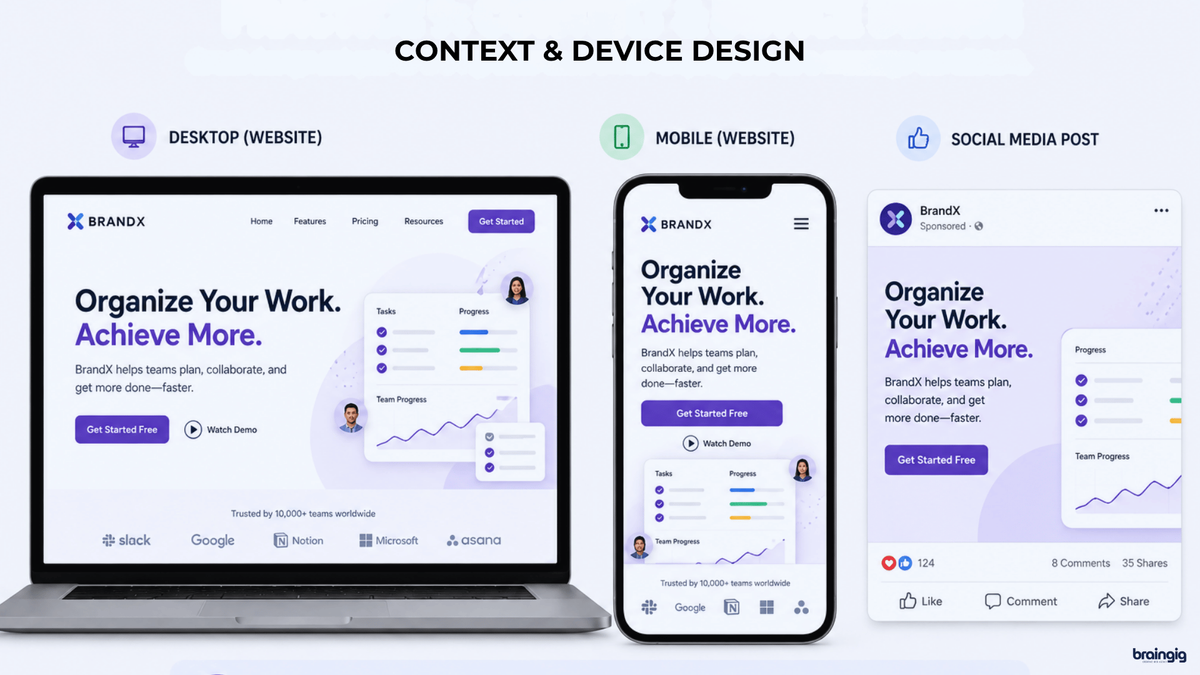
Graphic design today doesn’t live on a single canvas. A layout might appear as a website hero, a LinkedIn post, a mobile ad, and a slide in a sales deck. At the same time, with mobile devices accounting for approximately 55–65% of global web traffic in 2026.
That means your graphic design best practices have to include responsiveness and context: readable on small screens, clear in social feeds, and adaptable across formats.
How to put this into practice
- Preview designs in realistic mockups (phone screens, social feeds, presentations) before finalizing.
- Prioritize vertical or square crops for social media, where landscapes can feel tiny.
- Keep key text and focal points away from edges that might be cropped or covered by UI elements.
Graphic designing example: A complex infographic is impossible to read on mobile. You split it into a series of simple, scroll‑friendly panels for Instagram and a taller version for your blog, using the same design principles but tuned for each channel. Engagement doubles compared to the original single image.
Practice 10: Test, measure, and refine your designs
Finally, even the strongest design principles are still hypotheses until you see how real people respond. Visual content studies show that images and videos can increase views by up to 94% compared to text-only content, but performance varies by audience and context.
For example, visual content can get up to 94% more views and significantly higher recall rates (around 65% for images vs 10% for text) than text only, and interactive or data‑driven visuals often earn more engagement and backlinks than static content.
How to put this into practice
- A/B test key elements like hero images, CTA button colors, and thumbnail designs.
- Track metrics such as click‑through rate, scroll depth, and time on page for design‑heavy pages.
- Combine analytics with user feedback, ask people what they noticed first or what confused them.
Graphic designing example: You run two versions of a newsletter banner, one with a busy illustration and one with a simple layout, strong headline, and clear CTA. The simpler design gets a higher click‑through rate, reinforcing that clarity beats visual noise.
Final thoughts: strong design is simple, clear, and consistent
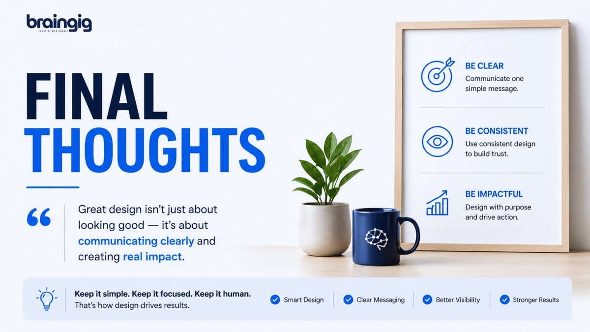
At the end of the day, the best graphic design best practices are not about making every visual flashy. They are about making your message easier to see, easier to understand, and easier to remember. When your layout is clear, your typography is readable, your colors are intentional, and your hierarchy is strong, the design starts doing real work for your business.
In my experience, the designs that perform best are usually the ones that feel calm and focused, not crowded or overdesigned. If you want your graphics to support SEO, GEO, social media, or paid campaigns, always begin with the message first and let the design support that message. That simple habit will save time, improve clarity, and make every visual more effective.
If you need help creating design-led marketing assets that look professional and convert better, contact BrainGig today! Our team can help you with branding, content, creative direction, landing page visuals, and marketing campaigns that are built to perform.
Summary: Topics Learned
Q: What is the first graphic design best practice to apply?
A: Start by defining one clear message and goal for each graphic. All other design principles like hierarchy, contrast, color, and layout become easier to apply once you know what should stand out first.
Q: How do design principles improve user experience?
A: Principles like hierarchy, balance, proximity, and unity help structure information so people can scan quickly, understand relationships between elements, and feel less overwhelmed, which leads to better engagement and conversion.
Q: Why is visual content so powerful compared to plain text?
A: Studies show people can recall images with around 65% accuracy after three days, compared to about 10% for text, and visual content can get up to 94% more views and significantly more shares than text‑only content.
Q: How should I apply color and contrast in my designs?
A: Use a limited palette, maintain strong contrast between text and background, and apply color consistently for actions and statuses. This aligns with both aesthetic design principles and accessibility best practices.
FAQs
1. What are the most important graphic design best practices?
The most important practices are starting with a clear message, using strong visual hierarchy, keeping layouts simple, aligning and grouping elements logically, choosing readable typography, and applying consistent color and contrast. These are repeatedly highlighted across professional design resources as the foundation of effective graphics.
2. Why do design principles matter for business results?
Design principles like hierarchy, balance, and unity help users understand information faster, make decisions more easily, and remember your message longer. Studies show that visual content can receive up to 94% more views and substantially higher retention rates than text‑only content, which directly impacts engagement, conversion, and brand recall.
3. Do I always need to follow every design principle?
No, principles are guidelines, not rigid laws. Experts like the Interaction Design Foundation emphasize using them with discretion based on your users’ problems and context, not blindly applying rules like “always use a 3:1 header ratio.”
4. How can I learn design principles if I’m not a designer?
Start with credible introductions from established platforms that explain concepts like hierarchy, contrast, and balance in plain language, then practice by recreating designs you like. Many designers build skills by copying layouts and then tweaking them for their own content.
5. What’s one simple change that usually improves a design immediately?
In my experience, increasing contrast and simplifying the layout, larger headlines, clearer CTAs, more white space, and fewer competing elements can almost always improve clarity and performance, especially on mobile.