

Key E-Commerce Mobile Optimization Tips To Maximize Conversions
Over the last few years, I’ve worked with e‑commerce brands that were getting plenty of mobile traffic, but very few sales from those visits. In almost every audit, the story was the same: mobile sessions made up most of the traffic, but mobile conversion rates were stuck under 2%, while desktop performed almost twice as well.
Recent benchmarks back up what I see in client accounts. Global ecommerce conversion rates often sit around 2-3%, but desktop shoppers convert at roughly 3.5-4% according to Dynamic Yield, while mobile conversion rates lag at about 1.8-2.5% on average and mobile drives around 78% of sessions for many stores according to Statista and The Droid on Roids, 2026. That means your mobile UX is not a “nice to have”, it’s a core profit lever.
In this guide, I’ll walk through how I think about e-commerce mobile optimization in 2026: from layout and thumb‑friendly navigation to product pages, checkout flows, and when it makes sense to invest in an e-commerce mobile app. I’ll keep it simple, share real numbers, and focus on changes you can actually make.
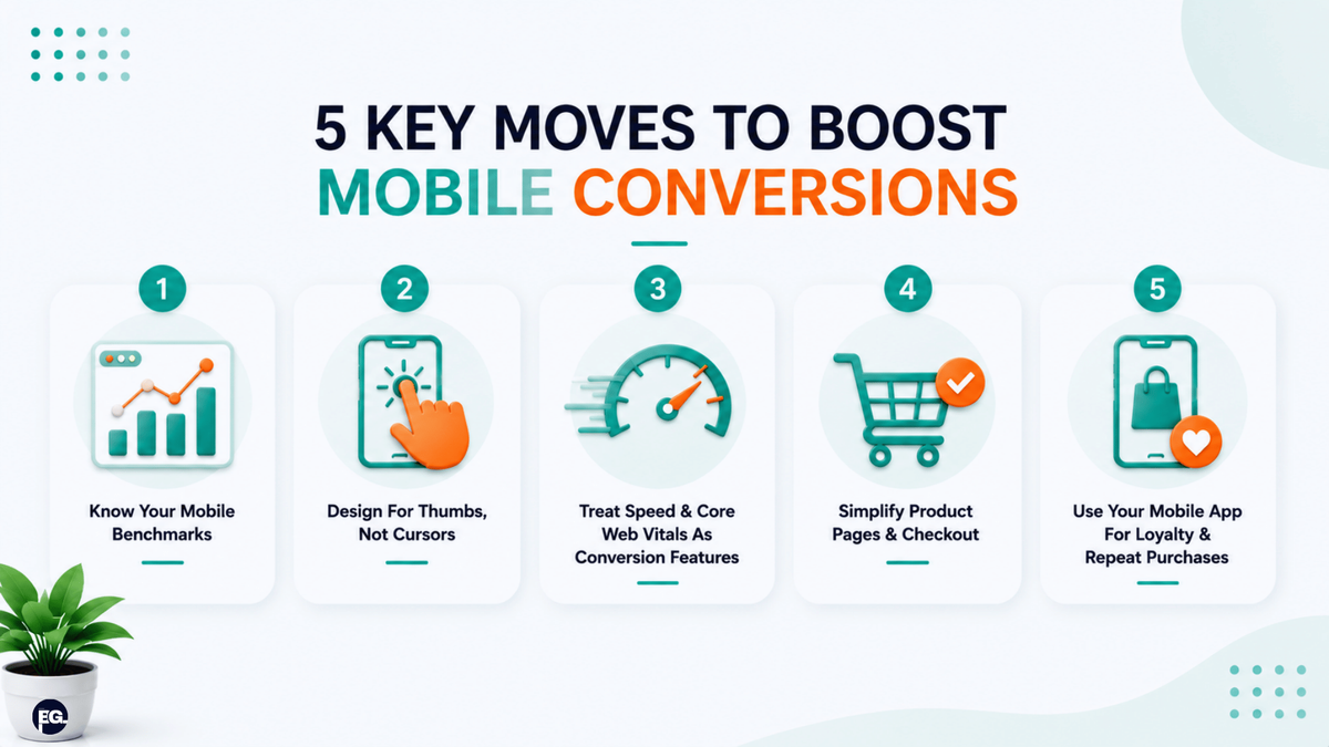
If you want the short version, here are the core moves I use when I’m trying to improve conversions from mobile:
- Know your mobile benchmarks and behavior: Mobile usually drives the majority of traffic but converts worse than desktop, closing even part of that gap can dramatically lift revenue.
- Design for thumbs, not cursors: Clear above‑the‑fold messaging, thumb‑friendly navigation, and large tap targets are now basic requirements for any e‑commerce mobile optimization plan.
- Treat speed and Core Web Vitals as conversion features: Sites that hit Google’s Core Web Vitals thresholds: Largest Contentful Paint (LCP) under 2.5 seconds, Interaction to Next Paint (INP) under 200 milliseconds, and Cumulative Layout Shift (CLS) under 0.1, see meaningfully lower bounce rates and better conversion performance on mobile.
- Simplify product pages and mobile checkout: High‑quality visuals, short copy, big CTAs, autofill, digital wallets, and fewer form fields can push mobile conversion rate into the 3%+ range.
- Use your e‑commerce mobile app for loyalty and repeat purchases: Apps often deliver much higher conversion and retention than mobile web when they’re designed for quick reorders, personalized offers, and smart notifications.
BrainGig note: The brands that win on mobile don’t just “shrink” their website. They build a focused e-commerce mobile optimization system that makes it easy to browse, decide, and buy in one hand.
Quick snapshot: mobile optimization checklist for e‑commerce
| Step | What it means in real life | Simple action to take |
|---|---|---|
| 1. Understand current mobile performance | Mobile drives traffic but underperforms on conversions | Compare mobile vs desktop CVR, bounce, and checkout drop‑off in analytics |
| 2. Fix thumb‑friendly navigation | Menus, CTAs, and search are easy to reach and tap | Move key controls to bottom, increase tap target sizes, simplify menus |
| 3. Speed up mobile pages | Pages load fast and feel responsive | Optimize images, use caching/CDN, fix Core Web Vitals issues |
| 4. Optimize product and checkout flows | Buyers see key details fast and can check out with minimal friction | Clean above‑the‑fold, larger CTAs, autofill, fewer fields, digital wallets |
| 5. Leverage e‑commerce mobile app features | App makes repeat buying effortless | Use personalized home screens, push for abandoned carts, and one‑tap reorde |
1. Start by understanding mobile vs desktop performance
When I review an e‑commerce account, I rarely start with design. I start with the numbers: mobile vs desktop traffic, conversion rates, bounce rates, and at which step mobile users drop out. In many stores, mobile accounts for 75–78% of traffic but converts at around half the rate of desktop.
Recent benchmark reports of Littledata suggest that a “good” e‑commerce mobile optimization target is around 2.5-3% conversion on mobile, while top performers push beyond 3.5%. For context, many Shopify stores still convert below 2% on mobile, which means there is plenty of room to improve performance.
How to put this into practice
- Check your analytics by device: mobile, desktop, tablet.
- Compare conversion rate, average order value, and checkout drop-off by device.
- Note which categories or pages underperform on mobile specifically.
This gives you a baseline and helps you see where e-commerce mobile optimization will have the biggest impact.
2. Design for thumbs: navigation, layout, and “thumb zones”
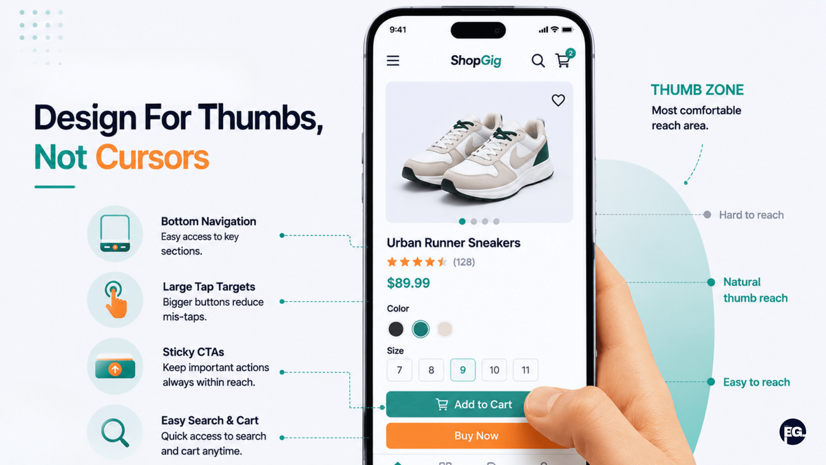
On mobile, people don’t have a cursor, they have a thumb. A lot of stores still ignore this and tuck critical actions (menu, cart, filters, add‑to‑cart) into hard‑to‑reach corners or small controls. From what I’ve seen, this is one of the fastest ways to kill mobile conversions.
Mobile UX research and best-practice guides highlight the same principles: clear above-the-fold messaging, thumb-friendly navigation, sticky CTAs, and large tap targets. For example, Deventia Tech’s 2026 mobile UX guide recommends placing primary navigation at the bottom of the screen and keeping key actions within easy thumb reach, while Google’s Material Design guidance supports using touch targets around 48 x 48 dp to reduce mis-taps.
Practical e-commerce mobile optimization steps
- Move your main navigation and cart icon into a bottom bar on mobile.
- Use big “Add to cart” or “Buy now” buttons that stay visible as users scroll.
- Keep menus simple: 4–5 core options (Home, Search, Categories, Cart, Account).
- Make search very easy to find, especially if you have a large catalog.
When I’ve helped clients implement these changes, we usually see reduced bounce rates and more users moving deeper into the funnel on mobile.
3. Treat speed and Core Web Vitals as conversion levers
Another pattern I see: mobile users drop off because pages take too long to load or feel jittery and unresponsive. On smaller screens and weaker connections, this problem is even worse.
Google Search Central guides consistently mention speed and Core Web Vitals as key drivers of both UX and conversion. Google’s Core Web Vitals benchmarks show that sites with an LCP under 2.5 seconds have significantly lower bounce rates and higher conversion rates than those exceeding 4 seconds, a gap that is especially pronounced on mobile.
Key performance areas to focus on
- Images: compress and resize images, use next‑gen formats like WebP or AVIF, and lazy‑load below‑the‑fold visuals.
- Code & caching: minify CSS/JS, enable compression, use browser caching, and leverage a CDN to speed up global delivery.
- Core Web Vitals: target LCP under 2.5 seconds (loading speed), INP under 200 milliseconds (responsiveness), and CLS under 0.1 (visual stability). These are Google’s official thresholds and failing them can hurt both rankings and conversions.
I like to remind clients that speed is not just “technical SEO”, it’s a direct part of e-commerce mobile optimization because every second affects how many people stay long enough to buy.
4. Make product pages visual‑first and easy to scan
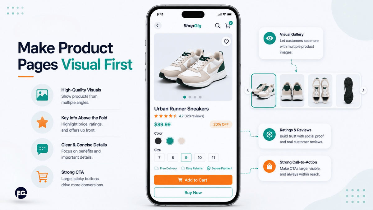
On mobile, people don’t want to read dense paragraphs, they want to see the product, understand the value quickly, and know exactly how to buy it. One of the biggest gains I’ve seen comes from turning product pages into visual, scannable layouts.
Mobile e‑commerce design guides recommend prioritizing high‑quality images, swipeable galleries, and short videos over long blocks of text, as visuals help users evaluate products much faster. These same sources also stress that essential information: price, key benefits, size or variant options, and CTA, should be clear above the fold on mobile.
Practical product page changes
- Use multiple product images with zoom and swipe; include context shots and detail shots.
- Ensure price, main benefit, and “Add to cart” are visible without scrolling.
- Break longer descriptions into short bullet points with headings.
- Add quick badges (e.g., “Free shipping over X,” “30‑day returns”) near the CTA.
When product pages follow this pattern, e-commerce mobile optimization becomes much more than a design exercise, it’s a direct path to higher confidence and faster decisions.
5. Streamline mobile checkout and payment options
This is often where mobile users “leak” out of the funnel. The data is stark: mobile cart abandonment sits around 85%, roughly 15–20 percentage points higher than desktop according to the Baymard Institute. The main reasons are long forms, friction at checkout, and a lack of fast payment options. Brands with optimized mobile checkouts, digital wallets, and shorter forms can push mobile conversion rates into the 3%+ range, well above the average 1.8–2.5%.
Practical e‑commerce UX guides recommend fewer fields, clear progress steps, large buttons, autofill, and support for wallets like Apple Pay, Google Pay, and Shop Pay. Those changes reduce friction and make checkout feel closer to a one‑tap experience.
Checkout optimization checklist
- Remove non‑essential fields; only ask for what you truly need.
- Enable autofill and use field‑specific keyboards (numeric for phone, etc.).
- Offer at least one fast wallet option alongside cards.
- Avoid intrusive pop‑ups or distractions during checkout, keep the focus on completion.
From what I’ve seen, improving mobile checkout is one of the highest‑ROI e-commerce mobile optimization moves you can make.
6. Use your e-commerce mobile app for loyalty and repeat sales
If you already have an e-commerce mobile app, or you’re considering one, it’s important to use it for the things apps do best: retention, personalization, and fast repeat purchases.
Studies from Dynamic Yield and Buildfire shows that e-commerce mobile apps often convert significantly better than mobile websites, one analysis found apps delivering conversion rates around 157% higher than mobile sites and average mobile e‑commerce conversion around 2.5-3%, with app‑driven stores often landing towards the higher end of that range when the experience is well optimized.
Where e-commerce mobile apps really help
- Personalized home screens: show recent views, saved items, and tailored recommendations.
- Smart notifications: bring people back with gentle reminders about abandoned carts, price drops, or back‑in‑stock items.
- One‑tap reorders: let repeat customers reorder frequent purchases in a couple of taps.
If your website handles discovery and your e-commerce mobile app handles loyalty and repeat orders, you get a stronger overall system rather than two disconnected experiences.
Final thoughts: treat mobile as your primary storefront, not a backup
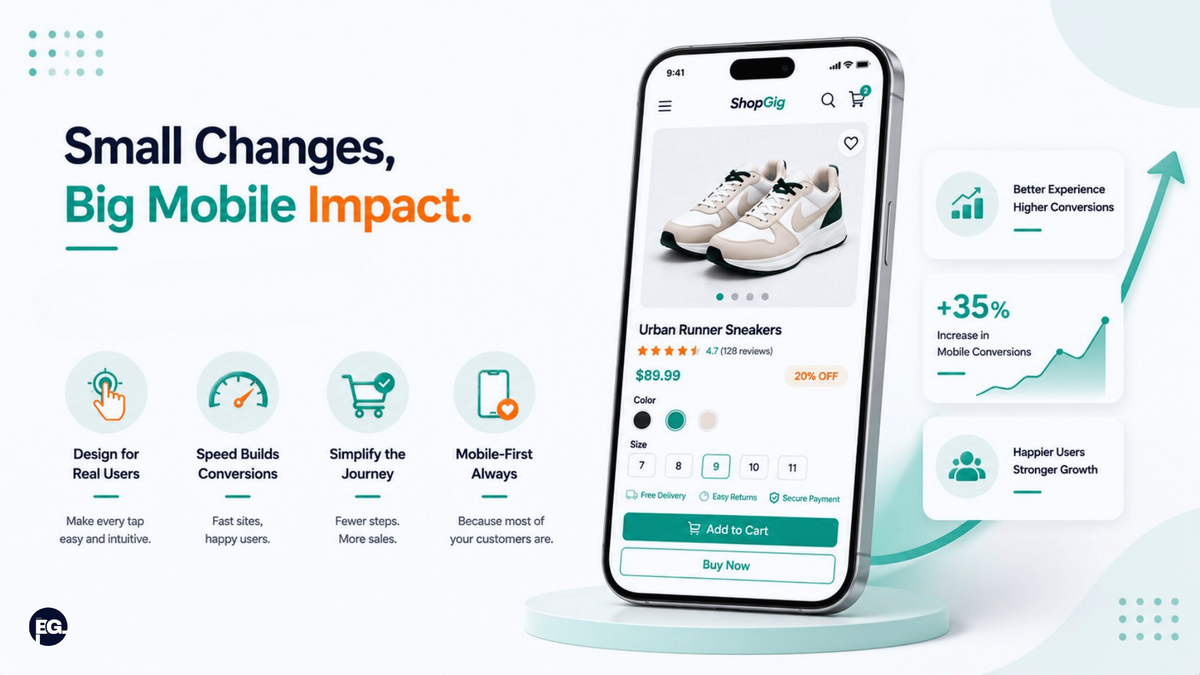
Looking at current traffic patterns and benchmarks, it’s clear that for many brands, mobile is no longer “secondary”, it is where most people first experience your store. When you treat e-commerce mobile optimization as your main storefront work, the gap between mobile and desktop conversion begins to shrink.
If your mobile site or e-commerce mobile app makes it easy to browse with one hand, see value quickly, and check out without friction, you’re not just fixing UX, you’re building a real competitive advantage in a market where most stores still underperform on mobile.
BrainGig helps e‑commerce brands improve mobile UX, optimize product and checkout flows, and build high‑performing e-commerce mobile websites so you can turn more mobile traffic into real revenue. Contact us now to get a tailored mobile optimization plan for your store.
Summary: topics learned
Q: Why is e-commerce mobile optimization so important now?
A: Because mobile drives around 78% of global e-commerce traffic but still converts at a lower rate than desktop and closing even part of that gap can significantly grow revenue.
Q: What is a good mobile conversion rate for e‑commerce?
A: Recent benchmarks suggest that around 2.5–3% is solid for mobile, while top performers push above 3.5% with strong UX, fast pages, and optimized checkout.
Q: How do e-commerce mobile apps compare to mobile sites for conversions?
A: Studies indicate that e-commerce mobile apps can convert up to 157% higher than mobile websites when designed well, thanks to better personalization and ease of repeat purchase.
Q: Which parts of the site benefit most from mobile optimization?
A: Navigation, product pages, and checkout, making those three areas faster, clearer, and thumb‑friendly usually delivers the biggest lift in mobile conversions.
FAQs
1. What is e-commerce mobile optimization?
E-commerce mobile optimization is the process of improving your online store’s experience on phones and tablets: speed, navigation, product pages, and checkout so mobile visitors can browse and buy easily without switching devices.
2. Do I need both a mobile‑optimized website and an e-commerce mobile app?
Not everyone does, but many brands see the best results when the website handles discovery and first purchases while the e‑commerce mobile app focuses on loyalty, personalization, and quick repeat orders.
3. What are the fastest wins for e-commerce mobile optimization?
Speeding up pages, simplifying navigation, clarifying product pages above the fold, and streamlining checkout (with fewer fields and digital wallets) are usually the fastest, most visible wins for e-commerce mobile optimization.
4. How can I tell if my mobile UX is hurting conversions?
Look for high mobile bounce rates, low mobile conversion compared to desktop, and sharp drop‑offs during product view or checkout steps, these are common signs that UX changes are needed.
5. How often should I review my e-commerce mobile optimization?
At least quarterly, and after any major design or platform change. Regularly checking analytics, running UX tests, and reviewing Core Web Vitals helps you catch issues before they cost you too many sales.